Technology
5 Ways Carts Boost App UX
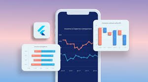
Effective user experience (UX) is critical for modern applications, particularly in data-driven industries where clarity and engagement define success. Charts, as visual representations of data, play a pivotal role in enhancing how users interact with and interpret complex information. JavaScript Charts, for instance, provide dynamic and interactive solutions that elevate application interfaces, making them more intuitive and engaging. This article explores five key ways charts improve app UX, focusing on their ability to simplify data, foster engagement, and support decision-making, with insights tailored to resonate with a British audience accustomed to efficient and accessible digital tools.
A developer from SciChart, a leading provider of high-performance charting solutions, offers this perspective: “Charts are more than visual aids; they transform raw data into actionable insights. By leveraging advanced JavaScript charting, developers can create responsive, real-time visuals that empower users to interact with data seamlessly, whether for financial dashboards or scientific analysis.” This commentary underscores the value of robust charting tools in achieving superior UX.
Simplifying Complex Data for Accessibility
Data complexity can overwhelm users, particularly when dealing with large datasets or intricate metrics. Charts address this by distilling numbers into visual formats that are easier to comprehend. For example, a line chart can illustrate sales trends over months, allowing users to grasp patterns without sifting through spreadsheets. This is especially relevant for British businesses, where sectors like finance and retail rely on quick, clear insights to stay competitive. By presenting data visually, charts reduce cognitive load, enabling users to focus on interpretation rather than processing raw figures.
Consider a financial app used by UK investors. A candlestick chart, commonly used to display stock price movements, conveys opening, closing, high, and low prices in a single graphic. This visual shorthand allows users to assess market trends at a glance, a critical feature for time-sensitive decisions. Similarly, in healthcare applications, charts can visualise patient metrics, such as heart rate trends, making it easier for practitioners to identify anomalies without navigating dense numerical reports. The ability to simplify complex information ensures that apps remain accessible to diverse users, from professionals to casual consumers.
Moreover, charts enhance inclusivity. Visual representations transcend language barriers and cater to users with varying levels of data literacy, aligning with the UK’s emphasis on accessible digital services. By transforming abstract numbers into intuitive visuals, charts make applications more approachable, ensuring users can engage meaningfully with content.
Enhancing User Engagement Through Interactivity
Interactivity is a cornerstone of modern UX, and charts excel at fostering user engagement through dynamic features. JavaScript Charts, in particular, support functionalities like zooming, panning, and tooltips, which allow users to explore data actively. For instance, a British weather app might use an interactive line chart to display temperature trends, letting users zoom into specific days or hover for detailed forecasts. Such interactivity transforms passive data consumption into an engaging experience, keeping users invested in the application.
In educational platforms, interactive charts can make learning more immersive. A history app, for example, could use a timeline chart where users click to explore events, revealing additional context like economic data or population growth. This approach aligns with the UK’s growing edtech sector, where engaging tools are vital for student retention. By enabling users to manipulate data, charts create a sense of control and curiosity, encouraging prolonged interaction with the app.
Interactivity also supports personalisation. Users can customise chart views, such as toggling data series or adjusting timeframes, tailoring the experience to their needs. This is particularly appealing in the UK, where consumers value personalised digital services, from banking apps to fitness trackers. By integrating interactive elements, charts not only enhance engagement but also build a connection between the user and the application.
Supporting Informed Decision-Making
Charts empower users to make informed decisions by presenting data in a context that highlights trends and relationships. In business intelligence applications, commonly used by UK enterprises, dashboards with bar charts or pie charts can reveal performance metrics, such as regional sales distributions. These visuals enable managers to identify underperforming areas and allocate resources effectively, a critical function in fast-paced markets.
For individual users, charts in personal finance apps can illustrate spending patterns, helping users budget more effectively. A stacked bar chart, for instance, might show monthly expenses by category, allowing users to spot overspending on leisure or utilities. This resonates with British consumers, who increasingly rely on digital tools to manage finances amid rising living costs. By providing clear, actionable insights, charts bridge the gap between raw data and practical outcomes.
In scientific and engineering applications, charts are indispensable for decision-making. A UK-based research firm might use scatter plots to analyse experimental data, identifying correlations that inform project directions. The precision and clarity of these visuals ensure users can trust the data, fostering confidence in their choices. By facilitating quick, evidence-based decisions, charts enhance the utility of applications across diverse sectors.
Improving Visual Appeal and Brand Consistency
Aesthetics play a significant role in UX, influencing how users perceive an application’s quality. Well-designed charts enhance visual appeal, making apps more inviting and professional. JavaScript Charts offer extensive customisation options, allowing developers to align visuals with brand guidelines. For a British retailer, a chart styled with brand colours and fonts can reinforce identity, creating a cohesive user experience that feels polished and trustworthy.
Consider a UK-based e-commerce platform. A visually appealing area chart displaying customer purchase trends can make the app feel modern and user-friendly, encouraging repeat visits. Customisation extends to themes, such as light or dark modes, which cater to user preferences and enhance accessibility. In the UK, where digital adoption is high, such attention to detail can differentiate an app in a crowded market.
Charts also contribute to narrative storytelling. A sustainability app, for instance, might use a progress chart to show a company’s carbon reduction over time, engaging environmentally conscious British users. By combining aesthetics with meaningful data, charts create a compelling visual narrative that resonates with users, enhancing their overall experience.
Optimising Performance for Seamless Interaction
Performance is a critical aspect of UX, particularly for data-heavy applications. Slow or laggy visuals can frustrate users, leading to disengagement. Modern JavaScript Charts, built with technologies like WebGL, deliver high performance even with large datasets. This is crucial for applications in sectors like finance or IoT, where real-time updates are essential. For example, a UK trading platform might use a real-time line chart to display market data, ensuring smooth updates without delays.
Efficient rendering also supports mobile users, a significant consideration given the UK’s high smartphone penetration. Responsive charts adapt to various screen sizes, ensuring a consistent experience across devices. A fitness app, for instance, might display a user’s workout progress in a responsive bar chart, accessible on both desktops and mobiles. This adaptability enhances usability, meeting the expectations of British users who demand seamless digital experiences.
Furthermore, performance optimisation reduces hardware demands, potentially lowering costs for businesses. By choosing a charting library designed for efficiency, developers can ensure apps remain responsive, even on lower-end devices. This focus on performance aligns with the UK’s tech-savvy audience, who prioritise speed and reliability in their applications.
Addressing Common Challenges in Chart Implementation
While charts offer significant UX benefits, their implementation requires careful consideration. Developers must select appropriate chart types to match data and user needs. For instance, a pie chart may oversimplify complex datasets, while a heatmap might overwhelm users with dense information. Understanding the audience—whether British professionals or casual users—guides these decisions, ensuring charts are both functional and intuitive.
Data accuracy is another critical factor. Inaccurate or poorly formatted data can mislead users, undermining trust. Developers must ensure data pipelines are robust, particularly for real-time applications like stock trading platforms. Additionally, accessibility features, such as screen reader compatibility and high-contrast themes, are essential to meet UK regulations and cater to diverse users.
Performance challenges arise with large datasets. Libraries address this through WebGL acceleration, enabling smooth rendering of millions of data points. This is particularly relevant for UK industries like aerospace or medical research, where big data is common. By anticipating these challenges, developers can maximise the UX benefits of charts.
Tailoring Charts to British User Expectations
British users expect digital tools to be efficient, reliable, and visually appealing. Charts must align with these expectations to enhance UX effectively. For instance, in the UK’s financial sector, users value precision and speed, necessitating charts that update in real time without lag. A candlestick chart in a trading app, for example, must deliver instant updates to support rapid decision-making.
Cultural preferences also influence chart design. British users often favour clean, minimalist aesthetics, as seen in popular UK apps like Monzo or Deliveroo. Charts with uncluttered designs and intuitive controls resonate well, avoiding visual overload. Additionally, mobile-first design is critical, given the UK’s high mobile usage. Responsive charts ensure accessibility, whether users are on a commute or working remotely.
Localisation is another consideration. Charts displaying financial data should use pound sterling symbols and UK date formats, enhancing familiarity. For example, a budgeting app might use a bar chart with GBP labels, making it instantly relatable. By tailoring charts to these preferences, developers create a UX that feels intuitive and relevant to British users.
Future Trends in Charting for UX Enhancement
As technology evolves, so do the possibilities for charts in UX design. Emerging trends include AI-driven chart generation, where algorithms suggest optimal chart types based on data patterns. This could benefit UK startups, enabling rapid prototyping of data-driven apps. Additionally, augmented reality (AR) charts, viewable on mobile devices, could transform sectors like education, allowing British students to interact with 3D data visualisations.
Real-time analytics will continue to grow, particularly in industries like finance and logistics. JavaScript Charts with WebAssembly support, for instance, can handle high-frequency updates, ensuring apps remain responsive. This aligns with the UK’s push towards cutting-edge tech solutions, as seen in London’s fintech hub.
Sustainability is another emerging focus. Charts visualising carbon footprints or energy usage can engage environmentally conscious British users, supporting the UK’s net-zero goals. By staying ahead of these trends, developers can leverage charts to create forward-thinking, user-centric applications.
Conclusion
Charts are indispensable tools for enhancing app UX, offering clarity, engagement, and actionable insights. By simplifying complex data, fostering interactivity, supporting decisions, enhancing aesthetics, and optimising performance, they create intuitive and engaging experiences. For British users, charts tailored to local preferences—such as minimalist designs and mobile responsiveness—elevate apps to meet high expectations. As technology advances, charts will continue to evolve, offering new ways to captivate users and deliver value. By integrating robust JavaScript Charts, developers can build applications that not only inform but also delight, ensuring lasting user satisfaction in a competitive digital landscape.

How On-Demand Delivery Can Double Your Sales

The Vital Role Of General Dentistry In Lifelong Oral Health

How to Choose the Right Mousepad desk mats for Your Desk Layout

How Rocket Canopy Windproof Walls Protect Your Booth in Harsh Weather

Why Preventive Dental Planning Matters For Households

Why Parasite Prevention Is A Central Focus In Veterinary Clinics

Common Mistakes People Make When Buying Paneer Cheese

7 Smart Reasons Designer Radiators Are Becoming a Must-Have in Modern UK Homes

Heavy Towing Near Me: Fast, Safe, and Reliable Solutions for Heavy-Duty Vehicle Recovery

From Messaging App to Digital Ecosystem: The Evolution of Telegram

Who Is Jennifer Rauchet?: All You Need To Know About Pete Hegseth’s Wife

Who Is Mindy Jennings?: All You Need To Know About Ken Jennings Wife

Who Is Enrica Cenzatti?: The Untold Story of Andrea Bocelli’s Ex-Wife

Who Is Klarissa Munz: The Untold Story of Freddie Highmore’s Wife

Who Is Mallory Plotnik?: The Untold Story of Phil Wickham’s Wife

Meet Christina Erika Carandini Lee?: All You Need To Know Christopher Lee’s Daughter

Who Is Allison Butler?: The Life and Influence of Kirk Herbstreit Wife

Who Is Terrance Michael Murphy?: Everything about Audie Murphy’s Son

Alec Bohm Wife: Everything You Need to Know About Jacque Darby

Who Is Jessica Marie Blosil?: Everything About Marie Osmond’s Daughter
How On-Demand Delivery Can Double Your Sales
The Vital Role Of General Dentistry In Lifelong Oral Health
How to Choose the Right Mousepad desk mats for Your Desk Layout
How Rocket Canopy Windproof Walls Protect Your Booth in Harsh Weather
Why Preventive Dental Planning Matters For Households
Why Parasite Prevention Is A Central Focus In Veterinary Clinics
Common Mistakes People Make When Buying Paneer Cheese
7 Smart Reasons Designer Radiators Are Becoming a Must-Have in Modern UK Homes
Heavy Towing Near Me: Fast, Safe, and Reliable Solutions for Heavy-Duty Vehicle Recovery
From Messaging App to Digital Ecosystem: The Evolution of Telegram
-
 Celebrity1 year ago
Who Is Jennifer Rauchet?: All You Need To Know About Pete Hegseth’s Wife
-
 Celebrity1 year ago
Who Is Mindy Jennings?: All You Need To Know About Ken Jennings Wife
-
 Celebrity1 year ago
Who Is Enrica Cenzatti?: The Untold Story of Andrea Bocelli’s Ex-Wife
-
 Celebrity2 years ago
Who Is Klarissa Munz: The Untold Story of Freddie Highmore’s Wife